ColCap is a diversified financial services company that provides a range of sophisticated products to financial institutions and mortgage managers across Australia.
As part of their ongoing growth and evolution, ColCap briefed Now We Collide to develop a new brand identity to reflect their innovative approach to financial services. With a client base of knowledgeable and experienced financial professionals, positioned within a highly competitive industry, ColCap were looking for a bold and forward-looking approach to their brand. Working closely with their senior team, Now We Collide created a logo and brand identity that builds on the heritage of the company and looks to the future growth ahead.
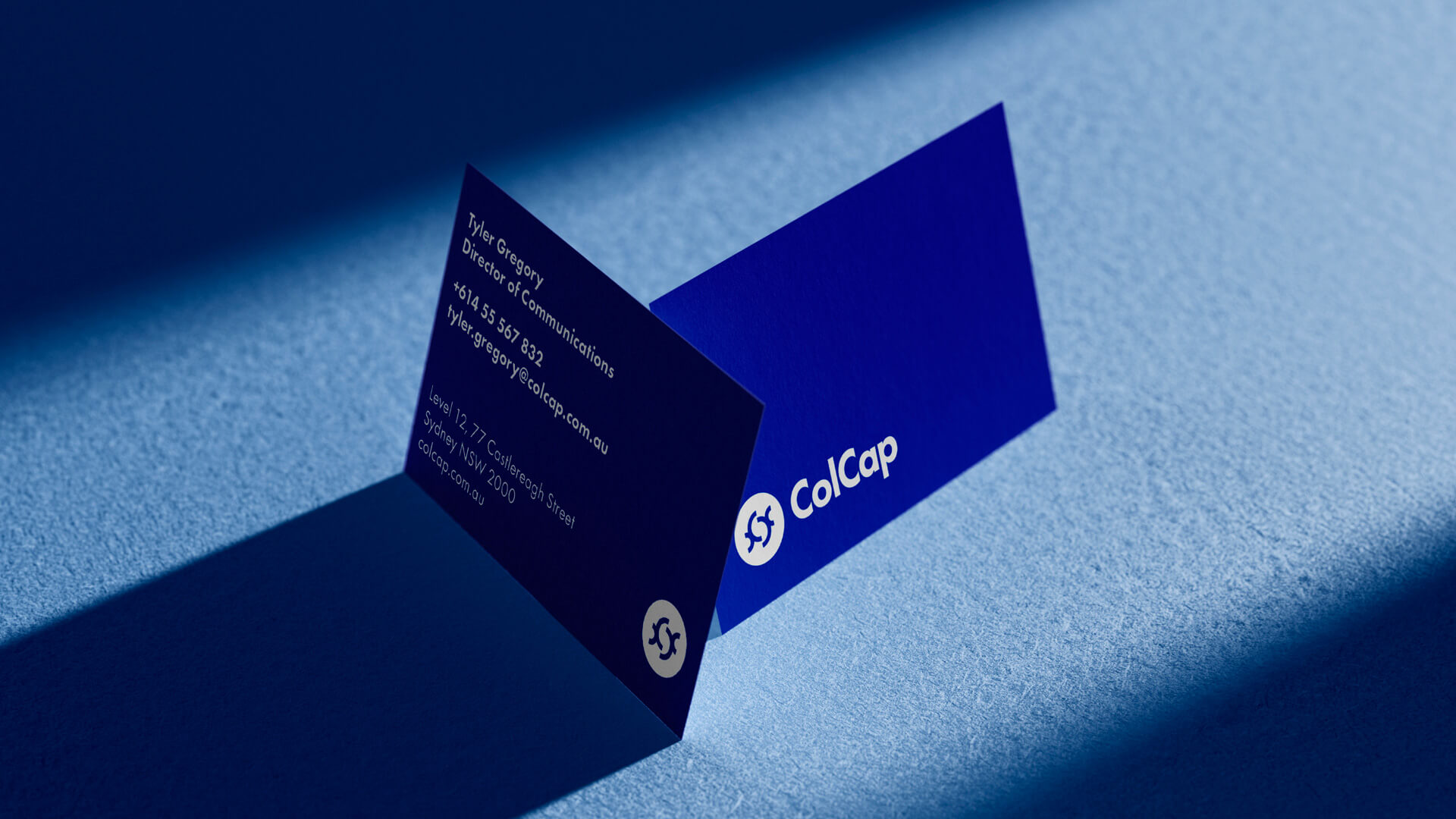
The new design pays homage to brands existing visuals, with refreshed collateral adapted to ensure ColCap looks at home within its sector and is positioned as a digital-first financial institution. Merging classic design and modern applications, the existing logomark was built upon to create a grounded, ownable icon. Inspired by the Bauhaus, with a subtly modified version of Futura for the logotype. Designed in 1927 by Paul Renner, Futura is based on geometric shapes, especially the circle, a form that is repeated in this brand identity.
For the colour palette, the existing core blue was adapted to include a bright, digital neon variant in addition to a darker navy blue as a nod to the brands history. For photography two distinct directions were developed; at a brand level coloured, abstract shots of urban and architectural scenes are used to add texture and visual interest, while also connecting to themes of a bustling business hub, infrastructure, urban development and finance. Content images focus more on people and moments, feeling realistic yet stylised, helping to add warmth and relatability.
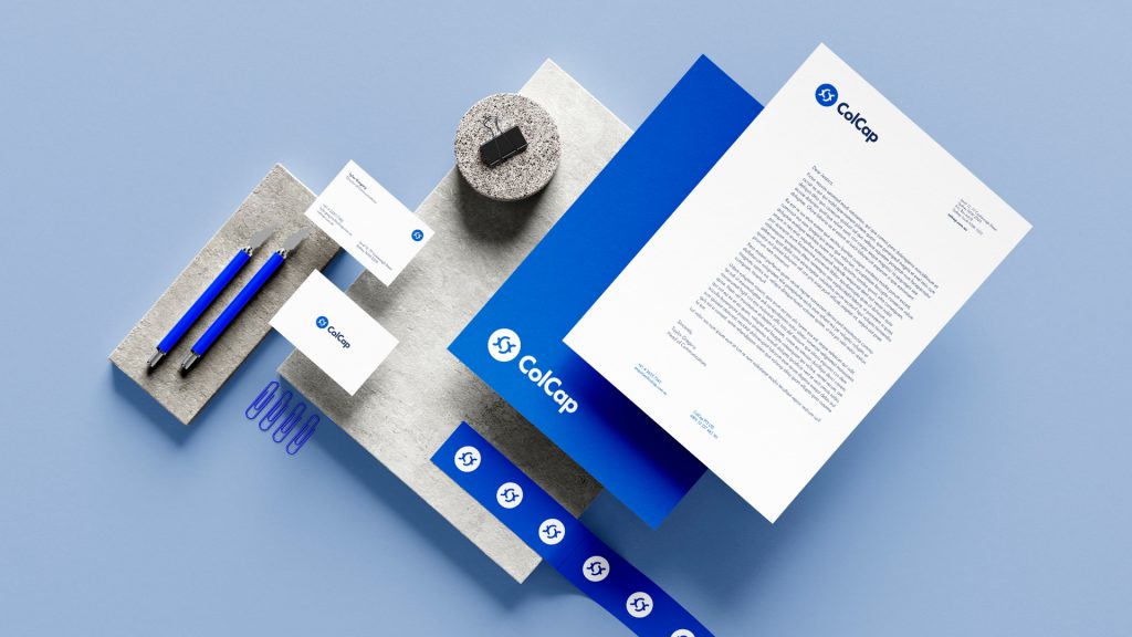
The resulting identity is bold, contemporary and flexible, allowing ColCap to stand alongside both traditional finance sector companies and digital fintech leaders.